i decided that i was going to use two words to work from, the words i have decided to use are time and wait.i then started to get a few ideas down for each word.
Time
- Clock
- watch
- stopwatch
- hourglass
- Tower clock
- Big Ben
- Day/Night
- Pregnancy
- Baby to Adult
- bud to flower
- sunset/ sunrise
Wait
- Traffic
- Traffic Lights
- Stop sign
- Ques
- Bus
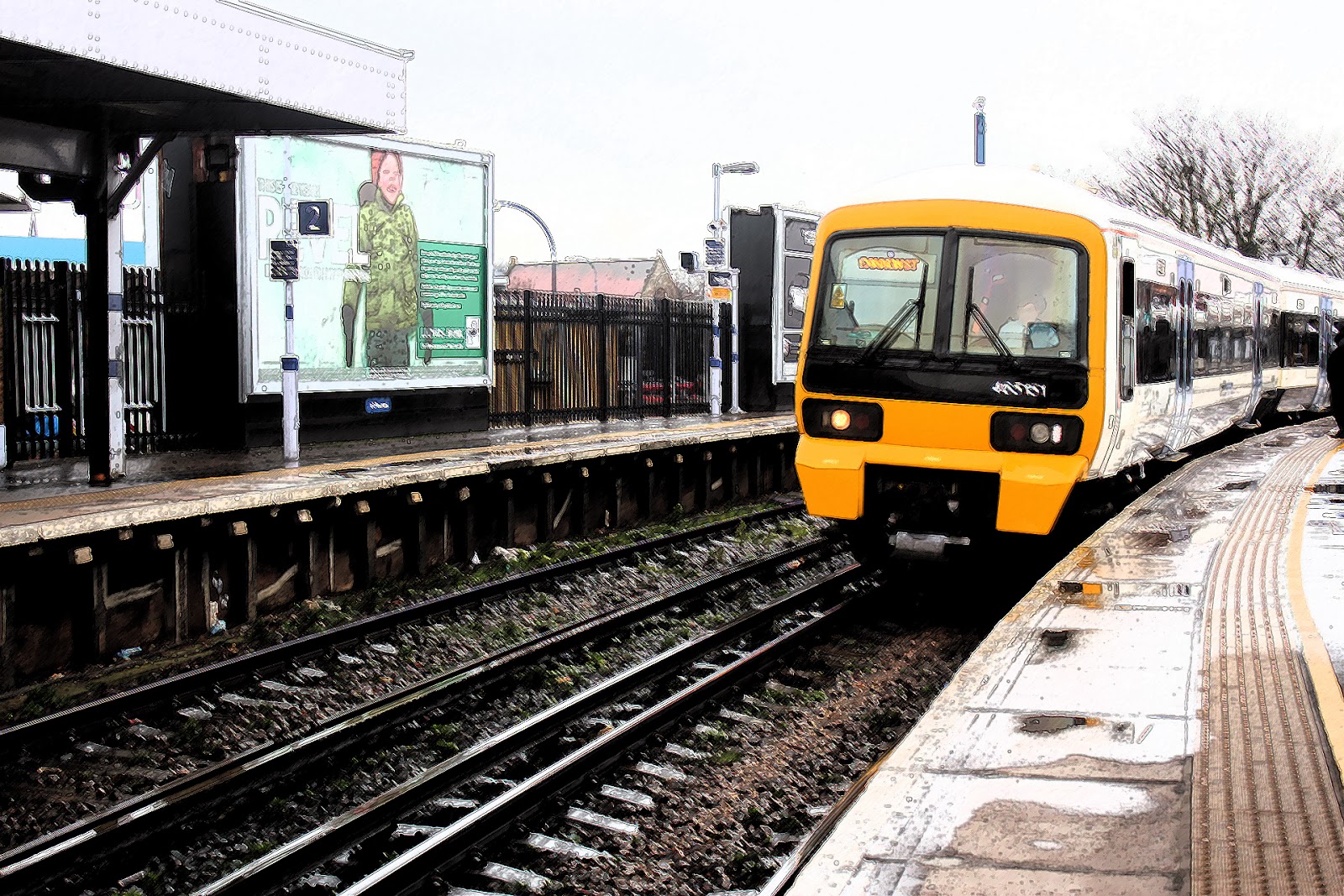
- Train
- DLR
- Airplaine
- Summer
- Winter
- Rain to stop
- Wind to Stop
I then went out and took some photos of what i thought interpreted these two words.


Before choosing my final images i decided experiment on photo shop with different filters and colour balances to see what different kinds of effects i could make.

Water colour filter
Brush detail -5
Shadow intensity -5
Texture -1

Poster Edges
Edge thickness 0
Edge intensity -8
Posterization -6
Ink outline
Stroke length -7
Dark intensity -19
Light intensity +33

Graphic pen
Stroke length -15
Light/Dark balance -41
Stroke direction - Right direction

Grain
intensity -81
contrast -62
grain type - Clumped

Colour balance
Shadows
Cyan - Red
0
Magenta - Green
-65
Yellow-Blue
0
Mid tones
Cyan - Red
+1
Magenta-Green
-33
Yellow-Blue
0
Highlights
Cyan-Red
-100
Magenta-Green
0
Yellow-Blue
0

Gradient Map
Blue, Purple, Red, Orange and Yellow
Opacity 21%

Gradient Map
Blue, Purple, Red, Orange and Yellow
Opacity 41%

Gradient Map
Blue, Purple, Red, Orange and Yellow
Opacity 50%

Gradient Map
Blue, Purple, Red, Orange and Yellow
Opacity 100%
After doing some experiment i have decided that the images i chose i will edit on photo shop to have a vintage style, which i will create by changing the brightness and contrast and then adding a Gradient map going from purple to yellow Over the top with an opacity of 28%
TIME


WAIT


I am really pleased with my series of photos i think they work very well together and I also think they well represent each chosen word. I really enjoyed this project as i like to experiment and play around with photo shop, i also enjoyed actually going out to find the right sort of image myself i found it quite a challenge.


