Saturday, 30 November 2013

Graphics Pathways - Day 7 Using Indesign & photoshop.

Today's task was to create a poster for a 2014 film The 33 using Indesign and illustrator
The 33 is based on a true story about 33 miners who got trapped in a mine shaft in chili for over two months
in this spider diagram i have jotted down loads of things i could use for my poster.

i then started to quickly sketch out small designs for the poster using the spider diagram to help me
i found it really easy to come up with some ideas most of them just came to me naturally when i had already started drawing, i found it most hard to decided which one of the posters was best and which one i liked.


There for i decided to try out a couple of layouts only creating the back ground for now.
i created these using computer soft wear such as photoshop and Indesign.
i feel that each one of these posters didn't work well for all different reasons.


The faces of the miners or the mineshaft would look better if it was in black and white.
The minors faces is more visible then the mineshaft.
Too much colour, very unclear what it is.


still looks very clear in black and white although i think it is better.
the mineshaft in the background is to unclear would not make a very good film poster because of that reason.


Really like this image of a mine shaft especially in black and white.
Very clear that is a mine shaft.
is also very clear that then men art photo shopped into this image.

i decided to keep the image of the mine shaft from the previous image and add the flag of chile over the top of it but so you are able to see them both.

here i have changed the opacity of the flag to 50% which is not enough, the flag is to clear and it is  hard to tell that the image in the back ground is a mine shaft.


here i have changed the opacity to 40% which is much better but i still think the flag need to be even less clear for the poster to work well.


Here i have changed the opacity to 30% which works perfectly, you can see both the flag and the mine shaft with ease, now i need to now add a text to the poster explaining what the film is and pick a font for the text to be in.


I have decided to uses a very basic normal font for this poster because it is very basic bold and clear to see i didn't want it to get lost in the image.

69 Days. 2300 ft Under. 33 Men.
This is what i have added to my poster to explain what the movie is about.
very short basic easy.


Over all i really liked this work shop, i improved my skills using photoshop and InDesign strongly, i am very happy with my outcome i really enjoyed making it and going through the whole process of trial and error.I think that it fits the brief and its a good film poster and doesn't give away to much and yet says enough.


Wednesday, 27 November 2013

Graphics Pathways - Day 6 final manifesto

                                                                       Final 4 Manifesto.

Tuesday, 26 November 2013

Graphic Pathway - Day 4 & 5


Manifestos
before i started to create my own manifesto i started to have a look at some already excising ones to get some inspiration on what i wanted my manifesto to be about and what i wanted my manifesto to look like.
here are some manifestos that i found and i really like that manifestos with very limited colour and that play about with the scale of the writing aswell, they look much more professional then the other manifesto that uses lot of colour and keeps everything the same scale and font.


I then started to think about my own manifesto and how i was going to make it and what it wold say.
I decided that i would make a hand drawn manifesto and one created on the computer using illustrator and indesign. I then cam up with some ideas about what i wanted my manifesto to say.
i found some quotes that i really like and i would like to use for my manifesto, these are a few of them
1. Our Grates weakness lies in giving up, the most certain way to succeed is always to try one more time
2. if you can dream it, you can do it.
3.Life is what you make it.
4.There  is no wrong and no right.

i decided to go with "there is no wrong and right" but i wanted to change the words about abit so i then started to get down some other ways to say there is no wrong and no right.
1.There is no mistakes
2.bad is good.
3.wrong is right.
4.Doing something wrong is right.

i decided to go with " doing something wrong is right" because i felt that it sounded alot better then "there is no wrong or right", it flowes better.

There are some design layouts i have come up with.


once i had chosen which layouts i was going to use i then went on to deciding what kinda of colours i would use and if there would be a particular colour theme.


i decided that i would stick to Red, black and white colour theme for i felt that when there was colour in the back ground it was too overpowering and it didn't connect to the type.

I then went on to choosing which font i was use for my manifesto.
The words "Doing something, is" would be written in a normal classic serif font not to big or bold.
And then the word "wrong" would be written in a Gothic style font quite big and bold.
"Right" would be written in a calligraphy style font very smooth a flowy.


Once i had chosen which fonts i wanted to use i then went on to actually creating my final hand drawn pieces. i have decided to do 2 for i really like all 4 of the different fonts and i wanted to use them all
i am very happy with the out come i think that it worked very well the colour theme worked really well and i really like the wrong on my second piece where it has not been coloured in and is just a outline.
i though the best media to work with to make these pieces would be pen and ink which did work really well.


Here i have been playing around with the font for "wrong" and what colour i will uses for each font.
I have edited some of the typefaces in illustrator to make them stand out and to make them more clear, which i then added them all together in Indesign.i kept "right" the same font for both of the manifestos because i feel that it fits perfectly.


Here i have made my manifesto in just black so i can see which of the two "wrong" fonts works best.
    

I think that this manifesto below works
    best the "wrong" font is much more 
    interesting.


Here i have added some colour to my manifesto i really like using just black and red, its not to over the top and very eye catching.
once again the manifeston the the left works better then the manifesto on the right.


i really like this manifesto below i think that the writing in colour is reversed colours works really its not
to over powering or boring.its very simple bold and eye catching. 


The red is to over powering and is not very                                     Very light pink into a darker pink.
nice to look at.it would work better if                                               i really like this but it is not right for
the red was slightly lighter.                                                                             manifesto.


Rainbow filter is to overpowering, way to much colour, it is very distracting and you look at the colour more than the manifesto.


Light blue to Light green.
doesnt really work very well.

Monday, 25 November 2013

Phobias Film Poster


I then created another phobias poster but this poster is a film poster to represtent our short stop motion film that we created.I decised to use the little girl characted edie in my poster since the film is about her. Here is a few quck sketches of design ideas i had of how i wanted the poster to look.


Once i has chosen which sketch i want to develop and turn into my final poster.I created this poster on photoshop.


I then added some text in to my Poster i feel that the font chosen fits the poster very well it has a creepy scary feel to it and a some what spider feel.
I also played about with the colour of the brown paper used behind Edie.

I then decided to add a small amount of dripping blood at the top left corner of the page. I personally don think that the dripping blood works very well, it doesn't go with the rest of the poster.I much prefer the poster with out the dripping blood.


Final Phobias Poster


This is my final phobias poster.
i have kept the same background images but changed the contrasted and added a old grainy effect filter over the top, which gives it a lot more of a scary/creepy feel and it also makes the poster seem old which also can been seen as a scary effect. i also changed the typeface i think that this type faces work much better then the one before its not to powerful and doesn't take all the attention of the images.
i am very pleased with my final outcome i think it came out better then i expected and i think it is very clear from the images and the filter that this poster is about phobias.

Graphics Pathway - Phobias Poster Design Ideas


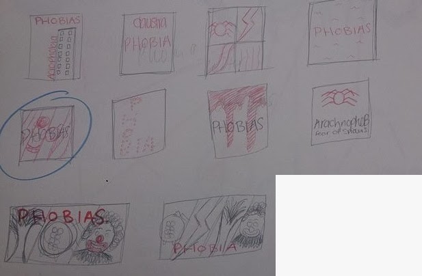
Here i have quickly sketched a few design ideas of how i could lay out my poster, i have decided that my favourite layout would be to have a image of 4 different phobias e.g Arachnophobia (fear of spiders), Coulrophobia, (fear of clowns) Scotophobia, (fear of darkness) Astraphobia (fear of lightning).


Here are my first 3 attempts at making a poster, the first poster i made i decided i would make very plain and simple, limited colour use and keeping everything in the same font.i liked the idea of this poster much more then the actual final outcome, i feel that it just didn't work as a poster is was not very visually interesting.


This is my second attempt at making my phobias poster, i decided that in this poster there would only be the work phobia and everything else would be images to show different phobias, i think that this poster works well and i really like it but the images that i have used are not scary/creepy enough there for i will find some other image's, also the type face doesn't work well with the images and as a poster font. 


This was my third attempt at making my phobias poster, the new images work much better they are much more scary and creepy but once again the typeface is not right and does not work as work for a poster it makes the poster look to cluttered and it is just too much to look at.
i want to use this background image for my poster and change the typeface to something a lot less bright.


Thursday, 7 November 2013

Graphics Pathway - Day 3

One we had the whole video filmed and it was how we wanted it we then got it on the computer and started to edit it and add in all the different type piece that everyone one had created.
We also decided that our film needed a creepy piece of music playing in the background, after looking at a few different piece of music we decided to go for a soundtrack from the nightmare before Christmas for it really worked with our film.

This is the Link to our finished film
https://www.youtube.com/watch?v=di9D8DcSq1g


i really enjoyed this whole process, i found it really good working with people that i had just only meet and seeing all the different ideas we all had and how we could collaborate them all and make a film that we was all really proud off.
i think that the film was successful and it got across the right kind of impression we wanted.

Graphics Pathway - Day 2

We then came up with another idea in which we would create a stop motion film, where some one would be filmed drawing out the whole film and then it would be speeded up on the computer.
we decided to have a small girl as our main character called Edie and she would have a phobia of everything she came across in the film.
This is the story board that we came up with.
we all really liked this story board and thought that it was clear enough for other people to know what our word is, so when then started to make it.


we thought it would be a good idea to have a piece of typography flash up saying which phobia she was about to encounter before it happened, i decided to make a piece of typography for the phobia Arachnophobia which is a fear of spiders.firstly i started to quickly draw a few sketches of what i wanted my type to look like.


i then picked my favourite one and started to work on it using illustrator to make the font more creepy and almost like spider legs, i then opened it into photo shop and added come spider Webb's over the text and added a pale green and red filer to give it a more creepy effect.
 This is my final outcome.
I really enjoyed making this piece of text and i really like the out come u think i have successfully created the creep feel that i was going for.


Graphics Pathways- Day 1

On our first day of the graphics pathway we was put into groups of 6 and then we was given a word which we then had to create a film about it all together and also make our own individual poster.
My groups word was phobia, so first we started to brainstorm anything that connected to the word phobia
we looked into where phobias first came from which was Greece and we found out the Greek word for phobia which is φόβος, we also found the correct term for loads of different phobias including our own.


We then started to get some idea down on what our video would be about.
Our first idea was to create a video which would explain where phobia came from and the definition of phobia, then have all the different phobias come up with images so it was clear what the phobia is, for some of them are not very clear what they are a phobia of.

Wednesday, 6 November 2013

Assessment Week - Self Directed Task

This is the second design that i have created i am really please with this design and how i have made the person in the image look like she is blowing the smoke out.i feel that this design is much better then the previous design i think that the smoke works alot more in this image and it looks more realistic.
once i had finished the basics of the design, i then decided i was going to add a colour filter over the top, i decided to go with a multi-coloured rainbow look for i wanted the smoke to look like it was changing colours.


I then decided to change my design again and make the person in this image look like she was also made out smoke, i much prefer this idea to the one before and i feel that it looks much better when i add the colour filter over the top, here i have added a light green merging in to light red filter over the top.

I think that the colours that i have used for this image did not work well at all there is not enough colour covering the smoke and it is the wrong colour.
This is the image that i have decided to use for my final poster for i really like how only the smoke is a ranger of different colours and the rainbow filter effect has really worked and i think it looks much better just the smoke then the person as well.