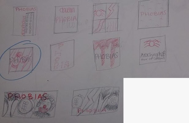
Here i have quickly sketched a few design ideas of how i could lay out my poster, i have decided that my favourite layout would be to have a image of 4 different phobias e.g Arachnophobia (fear of spiders), Coulrophobia, (fear of clowns) Scotophobia, (fear of darkness) Astraphobia (fear of lightning).
Here are my first 3 attempts at making a poster, the first poster i made i decided i would make very plain and simple, limited colour use and keeping everything in the same font.i liked the idea of this poster much more then the actual final outcome, i feel that it just didn't work as a poster is was not very visually interesting.
This is my second attempt at making my phobias poster, i decided that in this poster there would only be the work phobia and everything else would be images to show different phobias, i think that this poster works well and i really like it but the images that i have used are not scary/creepy enough there for i will find some other image's, also the type face doesn't work well with the images and as a poster font.
This was my third attempt at making my phobias poster, the new images work much better they are much more scary and creepy but once again the typeface is not right and does not work as work for a poster it makes the poster look to cluttered and it is just too much to look at.
i want to use this background image for my poster and change the typeface to something a lot less bright.


No comments:
Post a Comment