Once my design had been carved into the lino and the lino had been ink up it was then ready to be printed, here are some images of some of my experiment.
This was the first print that i printed, this print has come out very patchy and blotchy, I think this was because the layer of ink that was applied to the lino was very thin and there also could have not been enough pressured applied to the lino.
Even though this print did not come out the way i wanted it, i do really like the patchy/blotchy effect on this particular print, it makes it quite interesting to look at.
Here are some other experiment that i have done, all of these prints are in several different colours.
Brown
I really like this colour with the design, it gives it that traditional effect and i think they colour and design do work well together.This print could have been much better if there was slight more ink added to some small sections of the lino and if more pressure had been applied to the whole of the lino it would make the lines alot more clear and crisp.
Green.
I felt like this colour really didn't work with the design at all, it was very bright and i felt it was very eye straining, it really wouldn't have worked as a repeat pattern for wallpaper.Once again this print is quite patchy and really needed more pressure applied to it when it was being printed as i feel that the layer of ink that was applied was a good amount.
Blue.
This print has come over very well you can see all the detail in the design and most of the line are very clear and crisp, I think the blue colour works well with the design if it was going to be used as a tile repeat pattern that would be used in a bather room or a toilet maybe even possible a kitchen.
I then went onto experimenting with different colour prints onto different colour paper.
Black print onto Brown Paper
These two colours with the design really work well together as a single print but I think if it was to be repeated and made into wallpaper I don't think that it would look as nice then, I feel that brown isn't a colour that you would have on your walls in your home.
The yellow and red work quite well together but I don't think they work well together with my design.
The red is quite vivid and the yellow is very powerful, I don't think they would work well as a repeat patter wallpaper for that reason.
This print would have been better if there had been more ink on the lino, where there was not enough ink on the lino when there was pressure applied to it it made the ink stick to the card that is why the left bottom corner of the design is half missing.
White print onto Pink sugar paper.
This print had way to much ink on the lino, that it has fallen into the engravement on the lino, which had caused the print to be very unclear and messy.
The two colours work well together and i think they do work very well with this print, i think it would look very nice in a repeat pattern for wallpaper maybe used in a girls room or a living room.

White print onto Gold metallic paper.
This type of metallic paper didn't absorbed the block ink used because of this the print has gone very irregular and the ink has kind of separated its self. The result that it had given the print is very effective, I think that it could work as a repeat pattern for wallpaper to be used in a kitchen or dinning room.
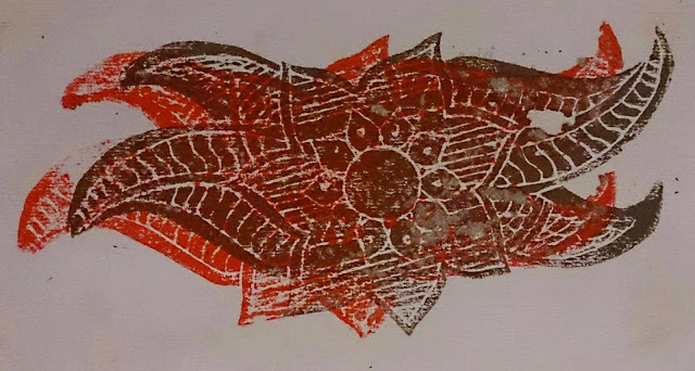
I thought it would be a nice idea to try printing my design twice together in two different colours, i decided to go with red and brown because i thought the two colours would complement each other and i feel that they were the two best colours that wen with my design.
I think that there was just to much detail in my design for the two prints and colours to work together in this way, which i was very disappointed about as i thought it would be really interesting to have this kind of print part of my repeat pattern wallpaper.
After i had done all my experimenting with my Mehndi print, I decided that i would use brown ink on top of plain white or off white wallpaper, as i felt that it was the print that worked best in the experiments and i really like the whole idea of keeping this repeat pattern as traditional as i possibly could.


No comments:
Post a Comment