Thursday, 22 May 2014

Final Major Project - Lino printing process.

Before I could start printing my lino design I had to make sure that I had all the right equipment first, this included :
  • A square piece of lino.
  • Lino cutting handle
  • Lino cutting blades
  •  Lino Roller
  • Printing ink
  • A thin sheet of plastic
  • Newspaper
 Once i had all of the equipment I could then start on my lino, firstly I transfered my design onto the lino using tracing paper making sure that my design was drawn on the opposite way round in which i wanted it for when i printed it, it would be printed in reverse, i then went over the pencil lines on the lino in a perniment marker so that when I started to engrave the lino the lines would not smudge or fade away.

I then started to cut out the lines that were drawn on my lino using a lino cutting handle with a cutting blade, the blade that i decided to use is called a Liner, i decided to use this blade for it created the thinnest lines and does not cut to deep in the lino.

Before I could ink up my lino I made sure that the area I was working in was  Protected so that I did not get ink everywhere, I covered the whole area in newspaper.

I then tapped the thin sheet of plastic to the desk so that it would stay in place when I rolled out the ink, I then applied a small thin line of ink on to the sheet of placed and used a lino roller to spread the ink over the piece of plastic, i did this so that it I would be able to apply a equal amount of ink over the lino.

Once the ink was rolled out equally I then applied the ink that was on the roller onto my piece of lino with my design engraved, making sure that the ink was equally spread and there was not too much ink or not enough ink on the lino.

when i was happy with the mount of ink on the lino i could then carefully place my piece of lino face down on the sheet of wallpaper/paper in the correct place, making sure not to move it about when it was placed down as it would smudge  the ink and would not make a good clean print.

I then applied a large amount of pressure on to the bottom of the lino using a new clean roller, which would then transfer my design onto the paper.

Once i was happy with the amount of pressure I had applied to the lino i would then very carfully peel the lino off of the wallapper/paper once again making sure to be very careful not to move it about too much as it would smudge the print.

When I produce a first print that I am happy with i then would repeat this whole proccess again untill I had printed on the whole sheet of wallpaper.

When creating a lino reduction print I would have to make sure that the first base colour of ink on the paper/wallpaper was dry before I could start my second layer, whilst waiting for the ink to dry I would then cut out the second and third sections of the lino.

Wednesday, 21 May 2014

Final Major Project - Print making timeline

Even though i know what printing technique i am going to use to make my wallpaper, I thought i would still find it intersting to look at a printmaking time line to find out al the different printing techniques and howthey developed over time.


200
Woodblock printing
Originated in China, woodblock printing was a technique that uses ink on blocks of wood to print images, texts or patterns which were engraved into them.

rbanks. (2009). Creating, cutting and printing your own woodblock.Available: http://www.instructables.com/id/Creating-cutting-and-printing-your-own-woodblock/?&sort=ACTIVE&limit=40&offset=40#DISCUSS. Last accessed 1st May 2014.

1040
Moveable type
Uses individual letters or punctuation to create a document, is a system of priting and typography.
Tina. (2013). Moveable type. Available: http://likeordinarylife.com/post/59764096061/movable-type. Last accessed 1st May 2014.

1500
Etching
A metal (copper, zinc or steel) plate is covered with wax and then engraved using a scratching technique by the artists where lines are wanted to appear, the metal is then dipped in acid to remove anything unwanted on the metal, it is then covered in ink and put through a high pressure press.

No Author. (2012). Etching Guide and Tutorial : Introduction. Available: http://www.wretchedetcher.com/etching-tutorial/etching-tutorial.html. Last accessed 1st May 2014.
1642
Mezzotint
Tonally roughing the plate with thousands of tiny dots made by a metal tool (a rook) with small teeth.
In printing the tiny pit holds the ink when the plate is being whipped clean.
Nancy Farmer. (2011). A first attempt at mezzotint…. Available: https://nancyfarmer.wordpress.com/2011/12/08/a-first-attempt-at-mezzotint/. Last accessed 1st May 2014.


1768
Aqatint
Acid is applied to make marks in a metal plate, powdered rosin is added to create a tonal effect.The tonal variation is controlled by the level of acid exposed over large areas.
Belinda Del Pesco. (2012). Silk Aquatint: The Captain's Cabin. Available: http://belindadelpesco.blogspot.co.uk/2012/01/silk-aquatint-captains-cabin.html. Last accessed 1st May 2014.

1796
Lithography
A stone or a metal plate that is a completely smooth surface covered in wax or oil and etched into then printed on to paper.
Andreas Praefcke. (2007). File:Lithography stone Princeton motif.jpg.Available: http://commons.wikimedia.org/wiki/File:Lithography_stone_Princeton_motif.jpg. Last accessed 1st May 2014.

1837
Chromolithograph
An image is applied to stone or zinc with a crayon, it is then gummed with gum arabic then dipped into weak acid then dunked into oil base ink then run through a priting press to create the image, this process is mainly used for multi-colour prints.
No Author. (2006). Chromolithography. Available: http://www.johngrossmancollection.com/id13.html. Last accessed 1st May 2014.

1843
Rotary press
Prints images from a curved round cylinder on to paper.
No Author. (2004). Custom Rotary Press. Available: http://www.sdmdiecuttingequipment.com/baseexchange.htm. Last accessed 1st May 2014.

19th Century
Hectograph
Transferring of an original prepared with special inks to a pan of getatint then pulled tight onto a metal frame.
No Author. (2014). Hectograph. Available: http://en.wikipedia.org/wiki/Hectograph. Last accessed 1st May 2014.

1907
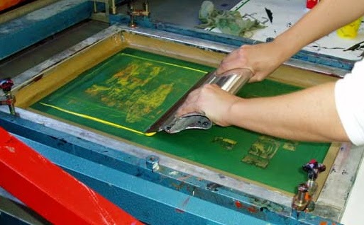
Screenpriting
A woven mesh/silk screen is used to support an ink blocking stencil, ink is applied to the top of the screen where the stencil is, then a squeegee is used to spread the ink all over the silk screen.

No Author. (2011). iW (No. 1) t-shirt screen printing. Available: http://www.ideasworkshops.com/idea-workshop-1-t-shirt-screen-printing/. Last accessed 1st May 2014.


Websites:
No Author. (2014). Printmaking. Available: http://en.wikipedia.org/wiki/Printmaking. Last accessed 1st May 2014.


Final Major Project - Wallpaper time line.

I decided to make a wallpaer time line so that I would have some more background research on wallpaper and I was also quite interested to know how wallpaper came about and when it was made.


4000 B.C
The first form of paper was formed in Egyptain papyrus.


105 AC
Paper making with textile waste was invented in China.


10th Century.
Paper was starting to be made from wood and bamboo which meant that it was of a higher quality.


12th century.
Papermaking had spread around Europe.


1418.
Artists were hand printing onto wallpaper for the richer people.


1509.
The first woodblock print that still exists today was made which is a print of a pomegranate.


1675
The first repeat pattern on wallpaper was made using the woodblock printing technique.


1680
Flocked wallpaper was created in Worchester.


18th century.
Wallpaper started to be created using tassled braids or fabric, velvet was massivly popular.


1785.
In France the first machine for printing wallpaper was invented.


1839.
In England a 4 colour printing machine was designed, where the designs were carved into cylinders that could make upto 400 rolls of wallpaper a day.


1850.
An 8 colour printing machine was invented.


1857
A 20 colour printing machine was invented.


20th century.
The wallpaper pasting machine was first invented.


1907.
Silkscreen printing was used to print designs onto wallpaper.


1920.
The first silkscreen machine was invented.


1936.
A powder pasted for wallpaper was created.


21st Century.
Modern printing facilities have replaced the historical printing methods.

Website:
No Author. (2014). Wallpaper. Available: http://en.wikipedia.org/wiki/Wallpaper. Last accessed 1st May 2014.


Final Major Project - Which type of wallpaper to print onto?

Once I had come up with my designs and I was happy with them I started to look at different types of wallpaper so I could choose which wallpaper would be best for me to print onto.


The first type of paper I started to look at using was lining paper, which is commonly used as a undercoat on a wall to cover imperfections on the wall then a thicker, nicer wallpaper will be pasted on top of it as the finishing thing.
I thought that this type of paper would be really good for me to print onto as it is not very thick and though and I think the ink would take very well to the texture of the paper.


I then looked at woodchip wallpaper which is made from small pices of chipped wood in the wallpaper, this is commonly used as a finishing wallpaper but usually some paint is added as well, this wallpaper would not be ideal for me to use for my prints as it has a very uneven surface and the lines in the lino would not be picked up properly.


Anaglypta paper was the next type of wallpaper that I looked at which is basically a plain version of embossed wallpaper which is just patterns/geometrical shapes or natural formed shapes raised into the wallpaper, this wallpaper would be very impractical for me to use as once again the lino cutting would not show on the shallow parts of the wallpaper and the ink would not take very well to the texture of the wallaper.


Flocked wallpaper was the last wallpaper that I considered in which the pattern on the paper was created in velvet that is slightly more raised than the wallpaper, once again this would be very impratical as the ink would clump together in the velvet which would look very unprofessional  and messy.


After looking at these main types of wallpaper I think that is very clear that the best type of wallpaper for me use would be the lining wallpaper, for it would be the only paper that the lines in the lino would actually show up on and I feel it would be the best one for a good finised look.

Final Major Project - Final Designs.

I have decided that I am only going to choose two cultural patterns in which  will create my own interpretation of them instead of three, for I feel that I do not feel strongly enough and was not really inspired enough about any of the other cultures that I have researched so therefore the outcome will not be as good or well thought out as my other two designs.
I really wanted to do a Mehndi design for I come from an Indian backgroud and I am hugely inspired by the beautifully hand-done designs that they apply to the hand on the week of her wedding. I also really wanted to do an Aztec culture design for I really like the colours and the use of geometrical shapes.
I really like how the bride's two designs are completely different; the Mehndi design uses natural forms and organic shapes and is very soft and smooth whereas the Aztec designs uses geometrical shapes and is very sharp and hard.
I am very happy with both of my designs and I think they will work very well as wallpaper designs and will look good printed out using lino.

Tuesday, 13 May 2014

Final Major Project - Aztec Designs

Once I had come up with my Mehndi designs, I also decided that I wanted to create an Aztec design.
I chose Aztec for I found the colour used really interesting and it is a whole lot different from my last chosen style to work with Mehndi.
I have decided to do a more contempory aztec design rather than the old tradional style, for my Mehndi design was quite traditional.


Design 1 - I found this design very messy and I feel that the design was too big and there was too much going on. I think this design may have been better if there was maybe a natural form/organic shape in the centre separating all of the triangles and geometrical shape a bit more.

Design 2 - Very messy once again and far too many of the same triangles used, makes it very hard to look at for a very long time for it is quite visually straining which would not work as a repeat wallpaper pattern.
Design 3 - This is more of the kind of design I am looking to do, have a central piece with repeating patterns above and below it but I think for this design it has not worked very well.

Design 4 - The centre design for this piece is i feel just doesn't work and does not look very visually interesting, I do like how it has another geometrical pattern/shapes that are not triangles.

Design 5 - the pattern that I have chosen for the centre piece I feel would work really well in the centre but the rest of this design is very messy and not very well thought out. It would be a lot more affective if it had just triangles or some other simple geometrical shapes.
Design 6 - Once again this design is very messy and not very well thought out, there are too many big patterns for it to be a good repeat pattern also none of them are repeated in the design.


Design 7 - This is the design that I have decided to go for, it was the most thought out design of them all and I think the central pieces works really well with the rest of the design, I think the triangle repeat patterns work really well.
My next step for this is to photocopy this design and test it out with some colours to see how it looks and if it is successful, if it is not I will then again change the design to fit the colours better.

Final Major Project - Mehndi designs

After doing all of my first initial research I have decided that I am definitely going to make my own repeat wallpaper pattern using the traditional Mehndi style of drawing/designs. Coming from a Indian background I am very interested in them and I really like that they are traditionally used for Indian weddings and each different item/object in the drawing/design means something different and also how each different placement on the hand can mean something different.
Even though it is traditional and drawn on the hand using henna I am going to make my own small Mehindi design which I will then create into a repeat pattern for wallpaper.

I then started to make a few sketches of some ideas of what I wanted to be in my final design and what my final design could possibly look like
I decided to go with a flower for I wanted to create a floral pattern also the flower is a symbol of joy and happiness when it is drawn onto the hand of a bride when she is going to get married.


Design 1- I really like the flower in the centre of the design and the almost paisley pattern shapes on the right side of the flower but I feel that the bubble-like shape on the top of the design is just slightly too much and that there is too many straight line throughout the design.

Design 2 - Once again I feel like there is to many straight line throughout this design and there needs to be more natural and organic shapes, it would be better if I changed the pattern inside of the outer bubble-like shapes.

Design 3 - in this design I have used more organic rather then geometrical shapes to create the flower, I think that the flower works a lot better then it has more geometrical shapes, but I think the flower with the organic shapes does work a lot better with the bubble-like shapes on the outside.
Design 4 - in this design I think that there is many organic curvy shapes, I feel that this design would be a lot better if it did not have the shapes on the top and the bottom of these design I think that are just slightly too much.

Design 5 - This design is one of my favourite designs but I think it is just too much to be a repeat pattern design for a wall paper, I think it would work if it was a simple normal Mehndi design being hennaed onto a bride's hand, I think that there is a good use of natural/ organic shapes as well as geometrical shapes.


Design 6 - this design was also one of my favourites but I felt that it was just too big and spaced out to turn into a repeat pattern but I do really like the design as a whole, once again it would work best if it was being used at a wedding to decorate the bride's hand.


Design 7 - This was also another of one of my favourites but I thought this design would look a lot better if it had the other flower in it that uses mainly straight lines, for I feel that this design used too much organic shapes and curves.

Design 8 - This is the design that I have decided to go with, I think it will work very well as a repeat pattern and as wallpaper. I definitely think using the more geometrical flower worked a lot better.